Early Modern
All three of my paintings are directly related to the influence of WW1. The first painting with all of the flags was a direct influence of WWI to the artist who was very patriotic and painted what was going on at the time. The paintings Great War and Over the Top were painted by war artists. They were commissioned to paint the war. Due to all three paintings being obviously influenced by the war, I tried to think about what the artists were feeling about the war when they painted their works. I think in Hassam’s, Early Morning On The Avenue In May the artist was feeling support and pride. Great War by Nevinson is very stoic and serious. I believe he was feeling fear and trepidation about the war. Over the Top by John Nash is so desperate. I think what he was trying to show the world with this work was the reality of war being devastating and tragic.
Title: Early Morning On The Avenue In May
Artist: Frederick Childe Hassam
Year painted: 1917
Oil on canvas
Place painted: New York City, New York, United States of America

This painting was part of a series of paintings that Hassam painted between 1916 and 1919. There are a total of 30 paintings in this series.
I could see this painting in many American homes. Americans love their flags.
Hassam was a patriot and used his work to demonstrate his support for the allies.
I love all of the brush strokes in this impressionist painting. It just makes for so much texture in the piece. The influence of the war really shows up in the colors of the painting. The only unmuted colors are the colors of the nation's flags and army green in the truck and tree in the painting. There is a lot of movement in the painting. The flags are waving in the breeze, people are walking and vehicles are moving down the street. I think the placement of the flags makes the theme of this painting strong. Think the name of the painting could have been better. I would have named it “Waving our support” This piece has a strong linear perspective with the buildings getting smaller the deeper down the street one looks. The value of dark to light on the buildings as more buildings were painted onto the street also creates depth and texture. I can tell where the sun is because of where all the shadows fall in the painting. On the left hand side of the painting there is a building with stairs. I like how the different shades of creams and white make the shape of this building. The colors are very close but just enough of a different hue to make the bends and turns of this building take shape. This piece makes me feel nervous about the war, scared in a way because I know the loss of life that occurs due to this war. It makes me feel proud and like people came together.
Title: Great War
Artist: C.R.W. Nevinson
Year painted: 1914
Oil on canvas
Place painted: Hampstead, London

“Within a few weeks of the outbreak of war in 1914, Nevinson journeyed to the front and began a stint as an ambulance driver helping to tend hundreds of terribly wounded soldiers. The deeply disturbing sights he witnessed, evidence of what havoc modern weapons could inflict on the human body, stayed with him for the rest of his life.” He was recruited as a war artist.
The lines in this painting are very sharp and angled. The placement of the soldiers that are clearer are down low and the soldiers with little detail are placed high and up top. The details of the French soldiers' faces are crisp but are more faded as the rows of soldiers go on. The men form a group winding through the street. I could see this painting in a museum or in a government building. I think war is too serious of a subject line to be in one's home. The colors are muted. This fits the theme of this painting. This is another painting of a street even though the street is covered with lined up soldiers. There is a linear perspective with the angling of the street even though it has a curve in it. The details get less clear and the soldiers in the far back are just circles for heads. This piece was more abstract but the set emotions of the faces are clearly serious. This painting makes me feel anxious. The families the French soldiers left behind. It must have been such a terrifying time and seeing weapons and uniforms must have been a stark reminder that this war was very much real and the people who left to fight it might not return. The colors are grays and blues of military uniforms. The brown of backpacks and the silver of the soldiers' service swords. The occasional red of a troop's French hat is visible. The texture is very flat with drewery feel to it.
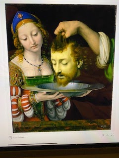
Title: Over The Top
Artist: John Nash
Year painted: 1918
Oil on canvas
Place painted: Chalfront St Peter, Bukinghamshire, England

Both of my grandfathers served in WWII. When looking at this painting I was reminded of my grandpa Bagwell refusing to tell us grandchildren anything about the war. He would always say it wasn’t proper to talk about. When I look at this painting I think of trauma and survival. To be able to ignore death beside you because you are doing all you can to survive leaves me with emotions such as desperate, heavy, determined and outraged that we couldn’t work out our differences. I wonder what my grandfathers went through that they couldn’t even talk about it. It must have been truly horrific. I would like to see these paintings that were influenced by war in high school textbooks. I think it is a great travesty of the public school system that the death and suffering that occurs in war due to failed negotiations for peace are not accurately depicted to older children who are about to become adults. Having these works purposely puts a stronger emphasis on working things out and not giving up on peace. To see the horrific destruction to families when war happens can be shocking. I wish before a country goes to war that every member of their adult population should have to see the destroyed homes and businesses and dead bodies of past wars. Maybe it would make them think more about giving up trying to work it out.
The weather in this painting reminded me of Alaska. With the thick white snow above the dirt and the dark skies. The colors remind me of the overcast days of winter in Alaska. The shadowing in the snow makes the snow look deep. The colors of the green uniforms are spot on. The yellow tint of the explosion is interesting. Just that little tint of color made what could have looked like snow look like an explosion. The darker negative space of the trench is also interesting. The top of the trench is a darker brown and the bottom of the trench is a lighter brown in order to highlight the boards to walk on at the bottom show and to highlight the dead who lay at the bottom. So many things in this painting would shock me if I saw it in real life. An explosion in the back, Is that a body being thrown up in the air? The dead bodies in the trench. I’d want to check to see if I could help anyone. My natural inclination would be to stop and look. Yet, these men push forward. I like that the artist didn’t have to show anything too gruesome with body parts or anything. Death was portrayed with lack of movement and just tiny touches of red to represent blood. I also like it that the painting isn’t clear to real life to traumatize the observer. Most of the faces in this painting are obscured. The half face of the man in the center but lower in the painting is the face that shows the most and where my eye is drawn toward. The value of the colors of the clouds goes from almost a white to a dark gray at the top. I found the clouds to be too low and maybe represent smoke from explosions that blend with the sky.
“Antiquesandartireland.com.” Antiquesandartirelandcom, https://antiquesandartireland.com/2017/10/auction-nevinson-sothebys/.
“Christopher R. W. Nevinson.” Wikipedia, Wikimedia Foundation, 15 Mar. 2022, https://en.wikipedia.org/wiki/Christopher_R._W._Nevinson.
“Early Morning on the Avenue in May 1917 - 1917 by Eric Glaser.” Fine Art America, https://fineartamerica.com/featured/early-morning-on-the-avenue-in-may-1917-1917-frederick-childe-hassam.html.
File:A Dawn by Christopher Richard Wynne Nevinson, 1914 ... https://commons.wikimedia.org/wiki/File:A_Dawn_by_Christopher_Richard_Wynne_Nevinson,_1914.jpg.
“First World War Painting Expected to Reach up to £1m at Sotheby's.” The Guardian, Guardian News and Media, 30 Oct. 2017, https://www.theguardian.com/artanddesign/2017/oct/30/first-world-war-painting-expected-to-reach-up-to-1m-at-sothebys.
“Over the Top (Painting).” Wikipedia, Wikimedia Foundation, 23 June 2021, https://en.wikipedia.org/wiki/Over_the_Top_(painting).
The three artworks you talked about, showed great representation of what those poor men were going through during the early 20th century. My favorite one you discussed was Great War by C.R.W. Nevinson. Not only is the repetition pleasing to view its also quite depressing. Knowing that all those poor soldiers are leaving to live in the trenches, with little to no hope of coming home. It’s so sad honestly.
ReplyDeleteApril, I admire the works that you chose to represent the theme of WWI. I like how each photo is from a different perspective of this time. Starting with the first art piece, Frederick Childe Hassam captured moments of solitude at each standstill, taking a second to appreciate their soldiers. Then, the second art piece reflects a scene from a battlefield—lastly, your third art piece captures men walking the streets with weapons in their hands.
ReplyDeleteEach piece that you chose has admirable artistic elements. Frederick Childe Hassam's use of curved lines to portray movement in the flags allows the illusion that the wind is blowing them around. C.R.W. Nevinson's use of shade from crisp white clouds to dark grey illustrates the clouds of smoke in the background. John Nash's use of shape, from more oversized-sized figures in the front of the canvas to the gradual change of miniature figures in the back of the painting, was very well done.
I thank your grandfathers for serving in WWII and making that sacrifice. You mention how your grandfathers refused to tell you about the war. After learning about the war through your research for this blog, are you glad they refrained from talking about it?
These pieces are all very directly related to WWI, great job. I can see exactly what each piece is trying to represent. My favorite piece was the last one, due to the very sharp lines and colors. You can tell it's more of an abstract piece, but it is very interesting to look at. It looks like a pattern of colors down the road where the soldiers are lined up.
ReplyDeleteThe middle piece also reminds me of Alaska, with the snow and hills in the background. There is such an intense feeling coming from that piece like you are truly there in the middle of the battle. Thank you to your family for their service.